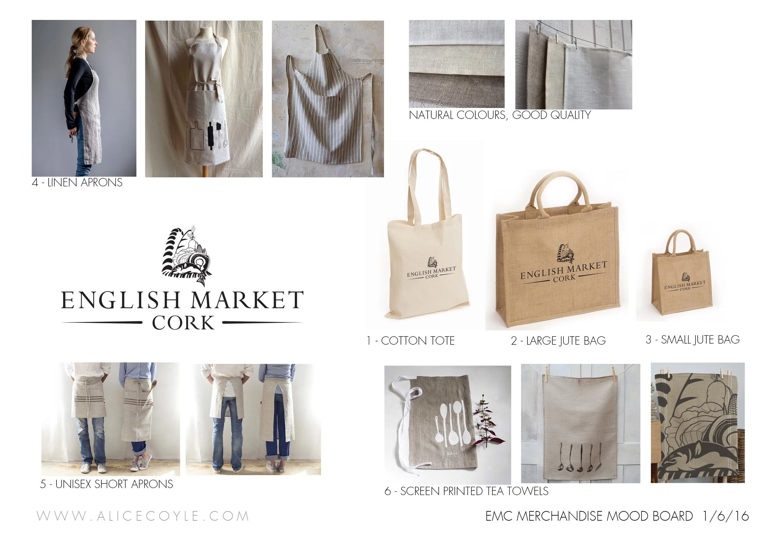
After the success of The Startup Stall, The English Market asked me to look at their branding. They had had their logo designed by another company and now wanted to integrate it throughout the market and all marketing material.
I began by bringing together the visual identity, using their existing logo, a complimentary typeface and a new colour palette. These colours were inspired by the existing fabric of the market; coloured floor tiles, timber structures and the of course the natural colours of the fresh produce on display throughout.
We then began to apply this new identity throughout the market in stages. Sometimes just by using the brand colours, and sometimes more obviously like when we used artist Johnny Bugler to paint the new logo large-scale in various spots throughout. I also designed new signage, letterheads and merchandise. And when the Grand Parade entrance was due for a facelift it was this new brand identity we worked from.


